Module for responsive images with image source sets for Hugo
Jan
- 3 minutes read - 538 wordsSince I started using Hugo for my blog I was looking for an easy way to optimize the website for different view port ratios and stumbled across Laura Kalbag’s post on Image processing and responsive design with Hugo. It was definitely a great starting point and exactly what I was looking for. After going with Laura’s solution for a few months now, I decided to have a go at it myself. Especially, after finding out about Hugo modules and Markdown Render Hooks.
Those two combined sounded promising to make responsive images reusable and easy.
In the end the solution turned out quite nice. It doesn’t change the way you interact
with images in Markdown and generates an HTML figure including captions, source sets
and title texts with support of any Hugo theme out there.
How to use it
If you are eager to get going and only try it out, go ahead and just add it to your website hugo configuration:
themes = ["github.com/jan-xyz/hugo-module-img-srcset"]
Using it is as simple as normal markdown and there is really not much to it. You simply add your image with an optional text and title

and the module automatically generates multiple sizes of the image,
$ ls -lh
-rw-r--r--  1 jan  staff   127K Oct 11 00:53 orion_hu3d03a01dcc18bc5be0e67db3d8d209a6_60130_1200x0_resize_q75_box.jpg
-rw-r--r--  1 jan  staff   180K Oct 11 00:53 orion_hu3d03a01dcc18bc5be0e67db3d8d209a6_60130_1500x0_resize_q75_box.jpg
-rw-r--r--  1 jan  staff    32K Oct 11 00:53 orion_hu3d03a01dcc18bc5be0e67db3d8d209a6_60130_500x0_resize_q75_box.jpg
-rw-r--r--  1 jan  staff    66K Oct 11 00:53 orion_hu3d03a01dcc18bc5be0e67db3d8d209a6_60130_800x0_resize_q75_box.jpg
and adds those to your resources and the references into the injected HTML:
<figure>
  <source media="(min-width:500px)" srcset="/pages/stuart_highway/day_01/images/orion_hu3d03a01dcc18bc5be0e67db3d8d209a6_60130_500x0_resize_q75_box.jpg">
  <source media="(min-width:800px)" srcset="/pages/stuart_highway/day_01/images/orion_hu3d03a01dcc18bc5be0e67db3d8d209a6_60130_800x0_resize_q75_box.jpg">
  <source media="(min-width:1200px)" srcset="/pages/stuart_highway/day_01/images/orion_hu3d03a01dcc18bc5be0e67db3d8d209a6_60130_1200x0_resize_q75_box.jpg">
  <source media="(min-width:1500px)" srcset="/pages/stuart_highway/day_01/images/orion_hu3d03a01dcc18bc5be0e67db3d8d209a6_60130_1500x0_resize_q75_box.jpg">
  <img src="images/orion.jpg"
    alt="young person walking through chest deep water in a pool on a sunny day. He has a flower in his hair."
    title="young person walking through chest deep water in a pool on a sunny day. He has a flower in his hair."
    style="width:auto">
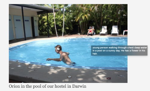
    <figcaption>Orion in the pool of our hostel in Darwin</figcaption>
</figure>
and this is how it looks like:

Implementation
To achieve this I heavily relied on features just recently implemented in Hugo.
The more important one is Markdown Render Hooks.
These render hooks allow overwriting the markdown renderer for things like images,
links or headers. It allows me to overwrite the way the HTML for images is generated,
adding sourcesets and the figure caption. To do this, you simply place a file called
render-image.html inside the folder layouts/_default/_markup/ which describes
how to render this image. The template you place in that folder receives a few
pieces of information, like the path (.Destination), text(.Text) or
title(.Title) entered into the Markdown code.
The other major feature supporting this plugin is actually the introduction of Hugo modules. These are modular pieces of a theme which can be combined. This allows anyone to embed the render hook into their own website and benefit from a more responsive experience on their Hugo website.
Future work
The plugin itself is quite simple but allows for a few extra configuration options. The most important one is probably making the view port and image sizes configurable.